
New England Branding: How Mountain Laurel Floral Designs Blossomed with Rely on Rach Brand Camp
- Rachel Averitt
- Jul 20, 2025
- 4 min read
Updated: Jan 18
Gabby and Pam already had magic. Two powerhouse women, farming and designing florals with a local first, sustainability always mindset, who had just leapt into their brick-and-mortar adventure. Their vision? A beautiful blend of wild blooms, hometown love, and zero pretension.
A dream project for me. They came to Brand Camp ready to dig deep—into who they are, why they exist, and how we could make sure every touchpoint, from business card to website,tells the same soul-filled story.
Step 1: Listening Before Designing
We start with real conversation—the kind where you don’t just talk business, you hear the heart behind it. Brand Camp kicks off with four deep-dive intake forms where we get crystal clear on who you are, how you serve, who you serve, and your position in the world. It’s where the magic starts taking shape.
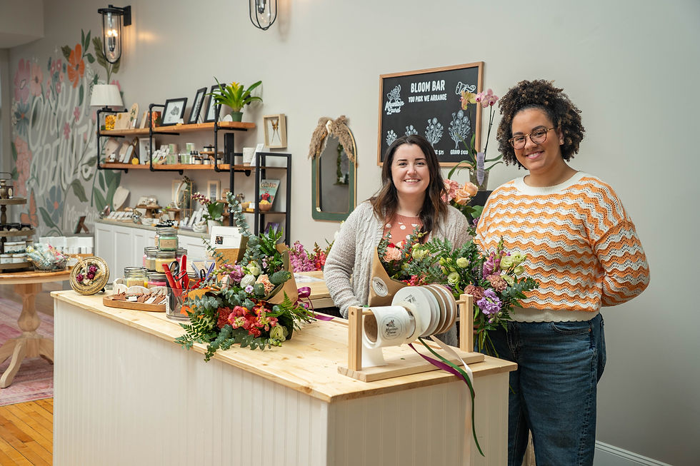
Gabby and Pam are the real deal: women flower farmers who pour their whole selves into what they do. Their shop is a curated love letter to their community, featuring tons of local makers, thoughtful gifts at every price point, and fresh, modern floral design that will stop you in your tracks.
They take their business seriously, treat their customers like family, and know how to make everyone feel welcome. Their hands-on classes are nourishing in every sense—creative and social. I wanted their brand to carry all of that: rooted in their ethics, alive with beauty, and grounded in the deep passion they have for uniting people through flowers.

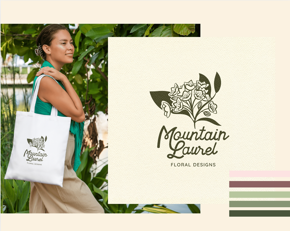
Step 2: Hand-Drawn & Heart-Led Logo
Their logo was inspired by the Mountain Laurel—Connecticut’s state flower and, of course, their namesake. I wanted it to feel like them—modern and fresh, but still grounded in the beauty and resilience of the bloom it represents.
I shared the first iteration, we did one thoughtful round of edits, and then one final round of small, intentional touches to bring it home. The result? A hand-drawn mark that’s instantly recognizable, personal, and deeply tied to their story.
Like every Brand Camp logo, they received it in multiple formats so it’s easy to use anywhere—from shop signage to Instagram posts—along with other hand-drawn elements to sprinkle through their branding for that extra layer of personality and consistency.


Step 3: Capture The Vibe With Photography
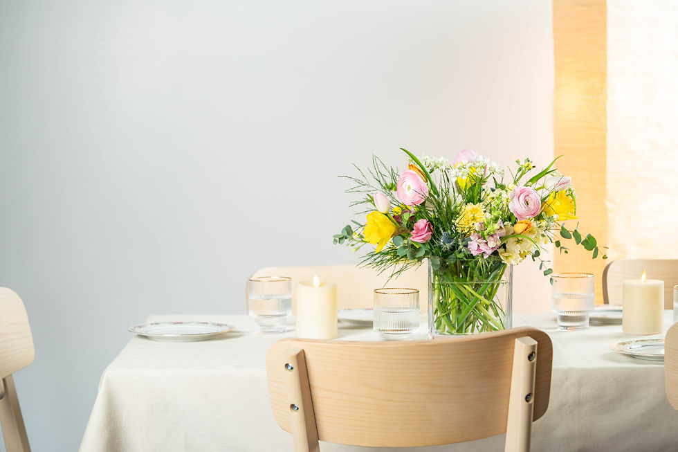
Great branding needs images that pull people in. For Mountain Laurel Floral, the photography was just as intentional as the design. We wanted every shot to feel like you’d just stepped into their shop: the light catching fresh petals, the shelves lined with local makers’ goods, the texture of ribbon on a just-tied bouquet.
We photographed not just the flowers, but the experience—Gabby and Pam’s hands arranging stems, the little details that make their space special. Those images now live throughout their website and marketing, creating instant recognition and helping customers feel connected before they ever step through the door.


Step 4: Turning Shopify into a Welcome Mat
Their new mountainlaurelfloralct.com site is THE place to buy flowers and the vibe is a digital extension of stepping into their shop... you can almost smell the blooms. Warm tones, thoughtful photography, easy-to-navigate pages—I hope it makes you feel at home.

Step 5: Online Meets In-Store
The goal was simple: when someone walks into Mountain Laurel after finding them online, it feels like one continuous experience. No disconnect. Alignment, beauty, and trust from the very first click to the moment folx walk out with an armful of flowers.

That’s Brand Camp.
I take your story, your heart, and your work, and combine it with my creative skills to make it shine everywhere you show up. It’s in the strategy, the design, the photography and it’s all about making sure people feel your brand the second they see it.
The finishing touch will be images from their farm fields - coming soon!
Gabby and Pam walked away with a brand that matches the soul of their studio. And I walked away knowing another small, women-owned, purpose-driven business is showing up in the world exactly as it is—confident, clear, and unforgettable.


Comments